“nina” VISUAL COMMUNICATION
VISUAL IDENTITY
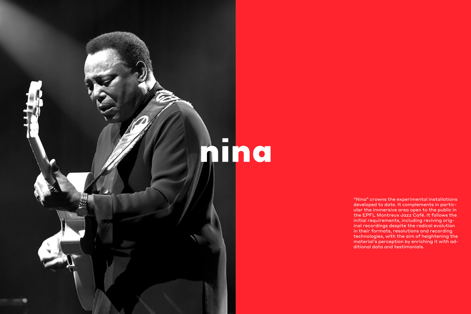
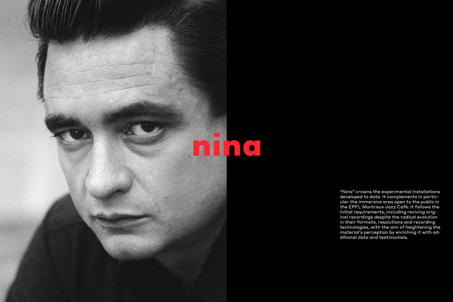
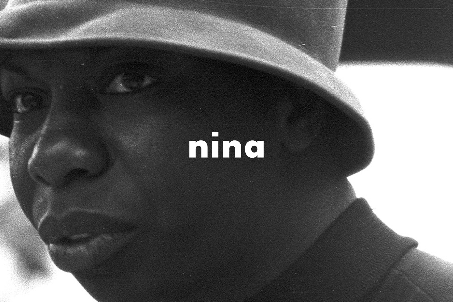
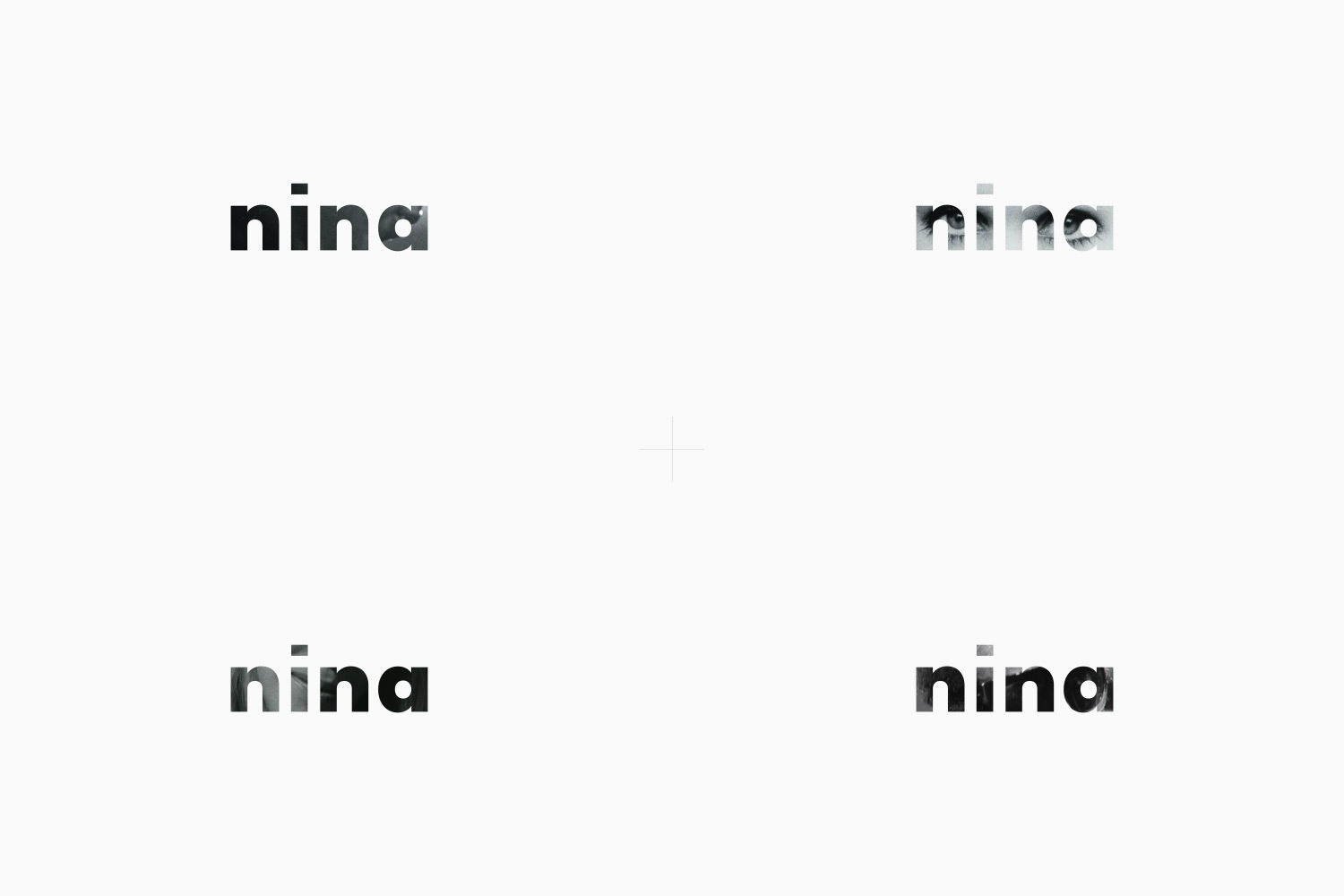
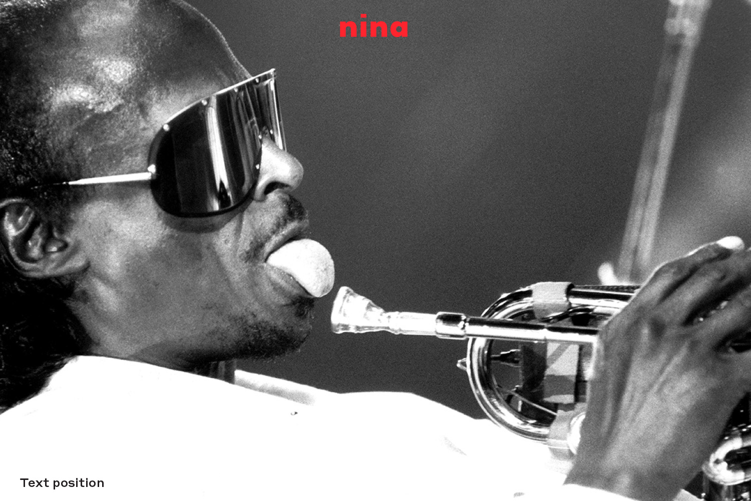
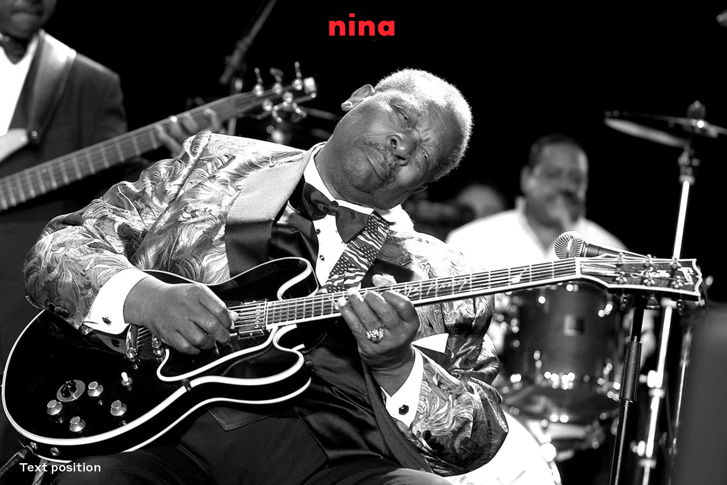
For “Nina”, the interactive installation that promotes the archive of the Montreux Jazz Festival, I created a visual identity that can evolve and decline, renewing itself from time to time, while maintaining distinguishable guidelines that characterize it.At the center of this identity is the photographic archive of the Montreux Jazz Festival. This incredible collection of images has great historical and cultural value and can give multiple new characters to the logo.The direction is that of a modern visual product that still refers to the color palettes and stylistic choices within historical design values.
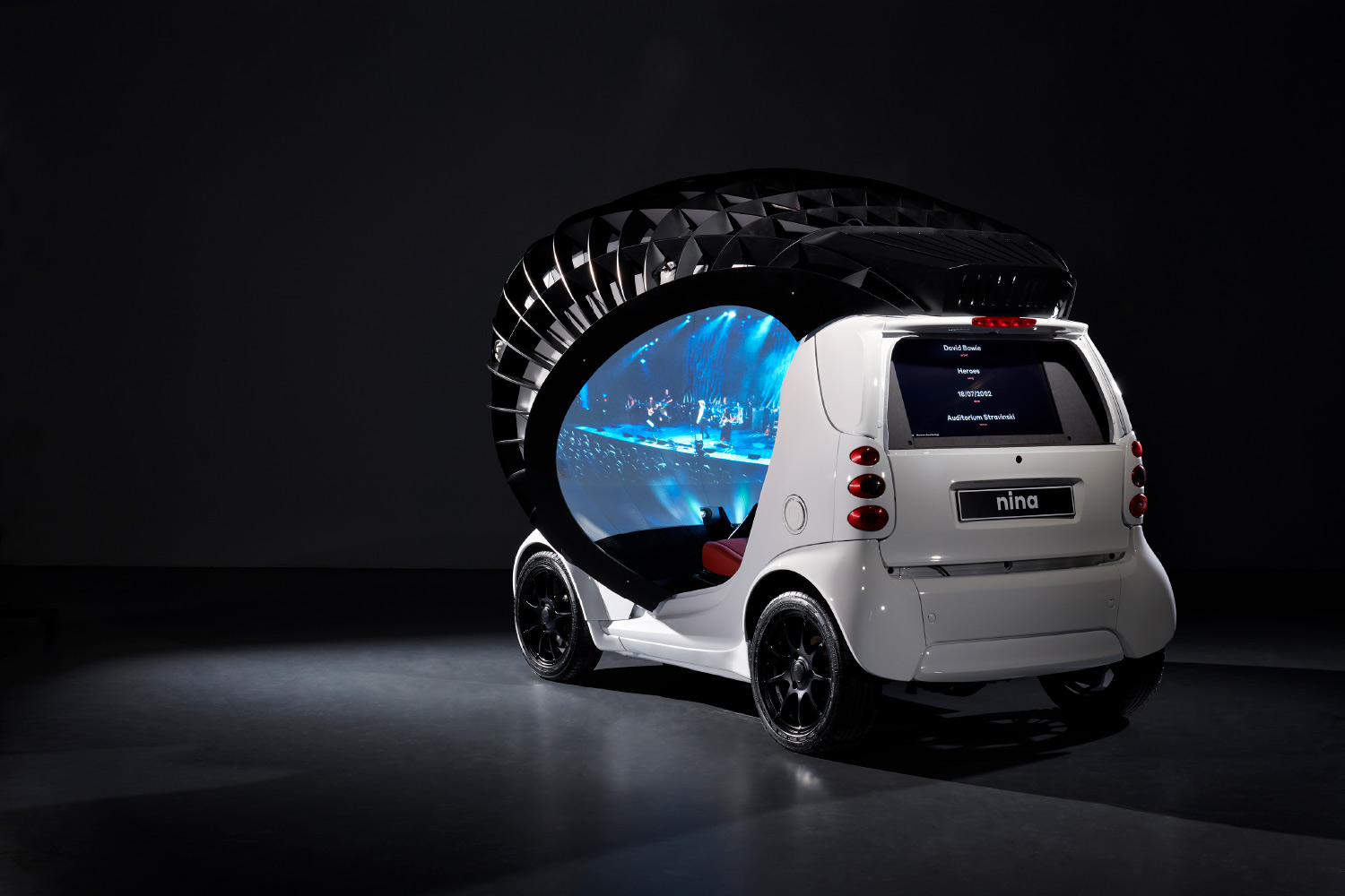
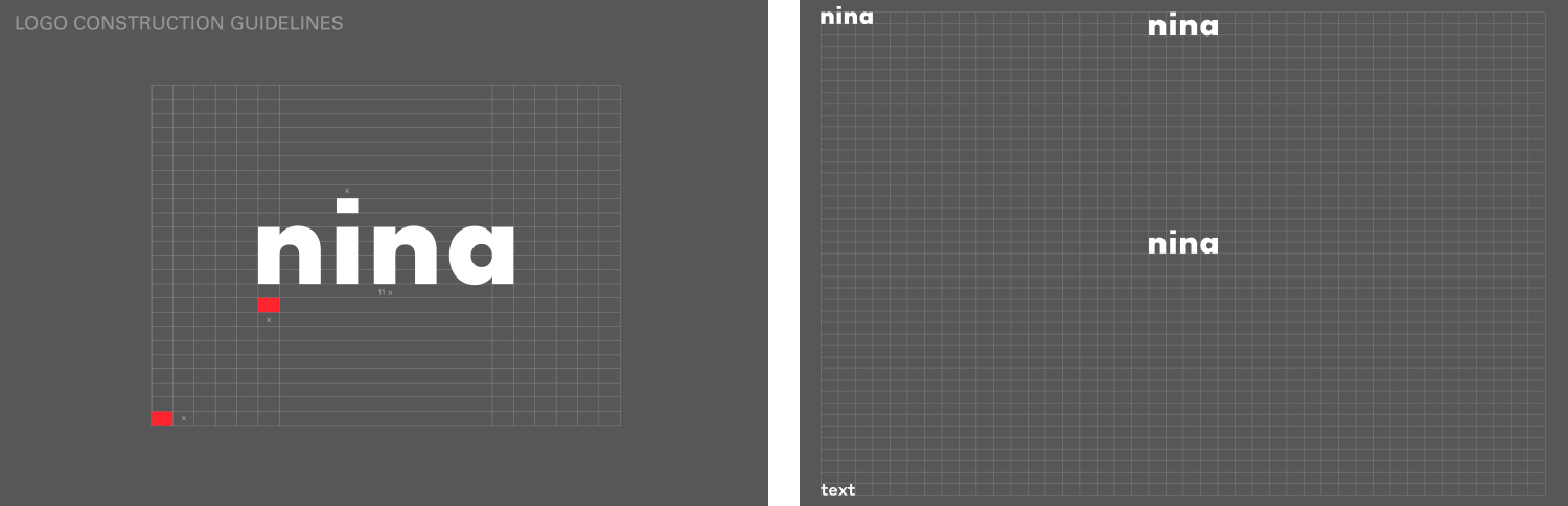
For the “Nina” logo, in order to be long-lasting, the character is not tied to contemporary fashions and has a geometry that references the structure of the car installation. This led us to evaluate classic characters such as Helvetica, grotesque, Akzident grotesque. And to reflect the aesthetics of the car, we moved to the Futura typeface, but it was too heavy to represent the light lines of the installation. For this reason, we found a lighter and more stretched variant of Futura. The dot of the i is replaced by a rectangular shape that becomes the creation and proportional form of the logotype and represents the digitization of the project.
I developed the whole visual identity and the first graphic declination of the “Nina” installation at the first release at the Montreux Jazz Festival 2018.

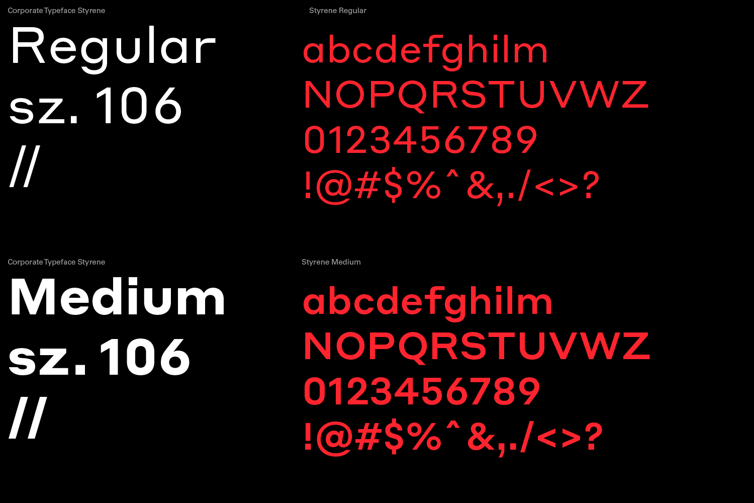
For the choice of the typeface, two precise inputs have come in to define the research.A character that would dampen the excessive modernity of the structure of the car and transmit the historical value of the archive. At the same time I needed a typeface that referenced the geometry of the car, and finally decided on Styrene, by the foundry Commercial Type.
A peculiar sans serif from the early 20th century with a decidedly a historical attitude.
In the declinations on the images and layouts it is important to maintain the composition guidelines and colorimetry
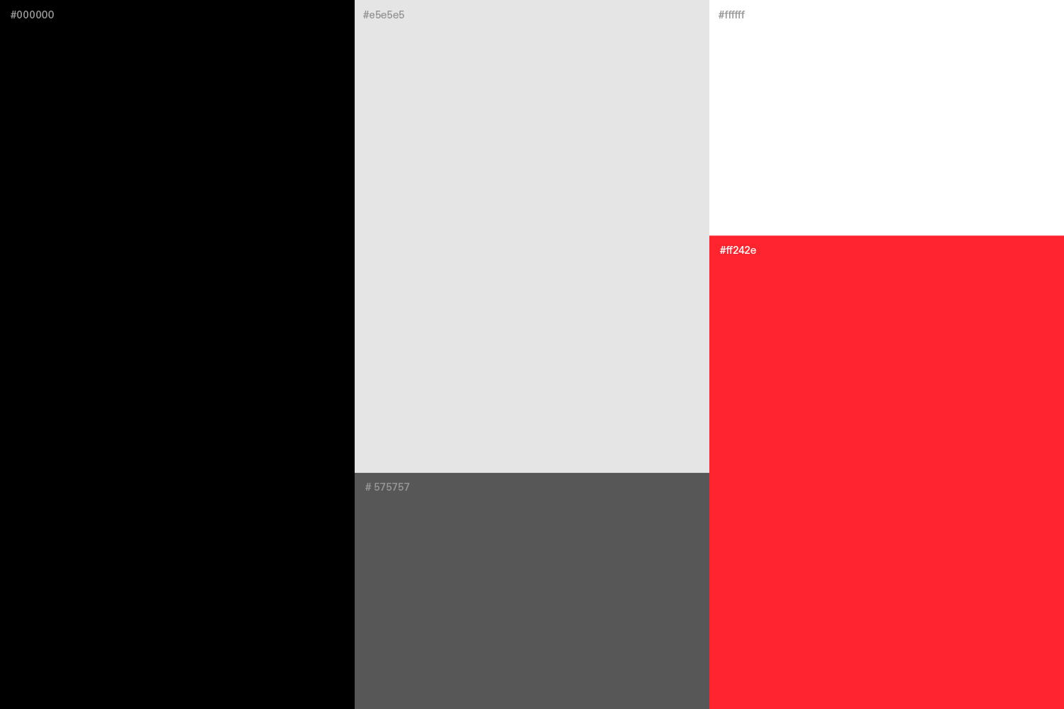
In the layout compositions a flat spot color is always matched between the color palettes